This blog has helped me to have a continuous work on writing and it has helped me to improve in English. In addition, we had to write about a topic every week and always about what we did in class during the week.
Apart from writing in this blog, I have done many activities to improve my writing. Some of them have been: doing exercises of different books; reviewing proposal, review, and letter; listening to the radio some days; reading some newspapers in English; watching some videos, and reading some books.
Although this blog has helped me a lot to improve, I think there could be some point that would be useful for the student.
For example, the students could write an extra work each week, in which they received feedback from the teacher, about different topics that you can find in the final exam of the semester. Thus, writing could be improved in the types of writings that Cambridge or the University of Murcia ask us for.
This simply would be a piece of advice I could give. For the rest, I am very grateful to write in this blog, which has helped me improve my English.
Warm colors include red, orange, and yellow, and variations of those three colors. These are the colors of fire, of fall leaves, and of sunsets and sunrises, and are generally energizing, passionate, and positive.
Red and yellow are both primary colors, with orange falling in the middle (making it a secondary color), which means warm colors are all truly warm and aren’t created by combining a warm color with a cool color. Use warm colors in your designs to reflect passion, happiness, enthusiasm, and energy.
RED (PRIMARY COLOR)
Red is a very hot color. It’s associated with fire, violence, and warfare. It’s also associated with love and passion. In history, it’s been associated with both the Devil and Cupid. Red can actually have a physical effect on people, raising blood pressure and respiration rates. It’s been shown to enhance human metabolism, too.
Red can be associated with anger, but is also associated with importance (think of the red carpet at awards shows and celebrity events). Red also indicates danger (the reason stop lights and signs are red, and that warning labels are often red).
Outside the western world, red has different associations. For example, in China, red is the color of prosperity and happiness. It can also be used to attract good luck. In other eastern cultures, red is worn by brides on their wedding days. In South Africa, however, red is the color of mourning. Red is also associated with communism.
Red has become the color associated with AIDS awareness in Africa due to the popularity of the [RED] campaign.
In design, red can be a powerful accent color. It can have an overwhelming effect if it’s used too much in designs, especially in its purest form. It’s a great color to use when power or passion want to be portrayed in the design. Red can be very versatile, though, with brighter versions being more energetic and darker shades being more powerful and elegant.
ORANGE (SECONDARY COLOR)
Orange is a very vibrant and energetic color. In its muted forms it can be associated with the earth and with autumn. Because of its association with the changing seasons, orange can represent change and movement in general. Orange is also strongly associated with creativity.
Because orange is associated with the fruit of the same name, it can be associated with health and vitality. In designs, orange commands attention without being as overpowering as red. It’s often considered more friendly and inviting, and less in-your-face.
YELLOW (PRIMARY COLOR)
Yellow is often considered the brightest and most energizing of the warm colors. It’s associated with happiness and sunshine. Yellow can also be associated with deceit and cowardice, though (calling someone yellow is calling them a coward).
Yellow is also associated with hope, as can be seen in some countries when yellow ribbons are displayed by families who have loved ones at war. Yellow is also associated with danger, though not as strongly as red.
In some countries, yellow has very different connotations. In Egypt, for example, yellow is for mourning. In Japan, it represents courage and in India it’s a color for merchants.
In your designs, bright yellow can lend a sense of happiness and cheerfulness. Softer yellows are commonly used as a gender-neutral color for babies (rather than blue or pink) and young children. Light yellows also give a more calm feeling of happiness than bright yellows. Dark yellows and gold-hued yellows can sometimes look antique and be used in designs where a sense of permanence is desired.
Cool Colors
Cool colors include green, blue, and purple, are often more subdued than warm colors. They are the colors of night, of water, of nature, and are usually calming, relaxing, and somewhat reserved.
Blue is the only primary color within the cool spectrum, which means the other colors are created by combining blue with a warm color (yellow for green and red for purple).
Because of this, green takes on some of the attributes of yellow, and purple takes on some of the attributes of red. Use cool colors in your designs to give a sense of calm or professionalism.
GREEN (SECONDARY COLOR)
Green is a very down-to-earth color. It can represent new beginnings and growth. It also signifies renewal and abundance. Alternatively, green can also represent envy or jealousy, and a lack of experience.
Green has many of the same calming attributes that blue has, but it also incorporates some of the energy of yellow. In design, green can have a balancing and harmonizing effect, and is very stable.
It’s appropriate for designs related to wealth, stability, renewal, and nature. Brighter greens are more energizing and vibrant, while olive greens are more representative of the natural world. Dark greens are the most stable and representative of affluence.
BLUE (PRIMARY COLOR)
Blue is often associated with sadness in the English language. Blue is also used extensively to represent calmness and responsibility. Light blues can be refreshing and friendly. Dark blues are more strong and reliable. Blue is also associated with peace and has spiritual and religious connotations in many cultures and traditions (for example, the Virgin Mary is generally depicted wearing blue robes).
The meaning of blue is widely affected depending on the exact shade and hue. In design, the exact shade of blue you select will have a huge impact on how your designs are perceived. Light blues are often relaxed and calming. Bright blues can be energizing and refreshing. Dark blues, like navy, are excellent for corporate sites or designs where strength and reliability are important.
PURPLE (SECONDARY COLOR)
In ancient times, the dyes used for creating purple hues were extracted from snails and were very expensive, so only royals and the very wealthy could afford them.
Purple is a combination of red and blue and takes on some attributes of both. It’s associated with creativity and imagination, too.
In Thailand, purple is the color of mourning for widows. Dark purples are traditionally associated with wealth and royalty, while lighter purples (like lavender) are considered more romantic.
In design, dark purples can give a sense wealth and luxury. Light purples are softer and are associated with spring and romance.
Neutrals
Neutral colors often serve as the backdrop in design. They’re commonly combined with brighter accent colors. But they can also be used on their own in designs, and can create very sophisticated layouts. The meanings and impressions of neutral colors are much more affected by the colors that surround them than are warm and cool colors.
BLACK
Black is the strongest of the neutral colors. On the positive side, it’s commonly associated with power, elegance, and formality. On the negative side, it can be associated with evil, death, and mystery. Black is the traditional color of mourning in many Western countries. It’s also associated with rebellion in some cultures, and is associated with Halloween and the occult.
Black, when used as more than an accent or for text, is commonly used in edgier designs, as well as in very elegant designs. It can be either conservative or modern, traditional or unconventional, depending on the colors it’s combined with. In design, black is commonly used for typography and other functional parts, because of its neutrality. Black can make it easier to convey a sense of sophistication and mystery in a design.
WHITE
White is at the opposite end of the spectrum from black, but like black, it can work well with just about any other color. White is often associated with purity, cleanliness, and virtue. In the West, white is commonly worn by brides on their wedding day. It’s also associated with the healthcare industry, especially with doctors, nurses and dentists. White is associated with goodness, and angels are often depicted in white.
In much of the East, however, white is associated with death and mourning. In India, it is traditionally the only color widows are allowed to wear.
In design, white is generally considered a neutral backdrop that lets other colors in a design have a larger voice. It can help to convey cleanliness and simplicity, though, and is popular in minimalist designs. White in designs can also portray either winter or summer, depending on the other design motifs and colors that surround it.
GRAY
Gray is a neutral color, generally considered on the cool end of the color spectrum. It can sometimes be considered moody or depressing. Light grays can be used in place of white in some designs, and dark grays can be used in place of black.
Gray is generally conservative and formal, but can also be modern. It is sometimes considered a color of mourning. It’s commonly used in corporate designs, where formality and professionalism are key. It can be a very sophisticated color. Pure grays are shades of black, though other grays may have blue or brown hues mixed in. In design, gray backgrounds are very common, as is gray typography.
BROWN
Brown is associated with the earth, wood, and stone. It’s a completely natural color and a warm neutral. Brown can be associated with dependability and reliability, with steadfastness, and with earthiness. It can also be considered dull.
In design, brown is commonly used as a background color. It’s also seen in wood textures and sometimes in stone textures. It helps bring a feeling of warmth and wholesomeness to designs. It’s sometimes used in its darkest forms as a replacement for black, either in backgrounds or typography.
BEIGE AND TAN
Beige is somewhat unique in the color spectrum, as it can take on cool or warm tones depending on the colors surrounding it. It has the warmth of brown and the coolness of white, and, like brown, is sometimes seen as dull. It’s a conservative color in most instances, and is usually reserved for backgrounds. It can also symbolize piety.
Beige in design is generally used in backgrounds, and is commonly seen in backgrounds with a paper texture. It will take on the characteristics of colors around it, meaning it has little effect in itself on the final impression a design gives when used with other colors.
CREAM AND IVORY
Ivory and cream are sophisticated colors, with some of the warmth of brown and a lot of the coolness of white. They’re generally quiet, and can often evoke a sense of history. Ivory is a calm color, with some of the pureness associated with white, though it’s a bit warmer.
In design, ivory can lend a sense of elegance and calm to a site. When combined with earthy colors like peach or brown, it can take on an earthy quality. It can also be used to lighten darker colors, without the stark contrast of using white.
In Brief…
While the information contained here might seem just a bit overwhelming, color theory is as much about the feeling a particular shade evokes than anything else. But here’s a quick reference guide for the common meanings of the colors discussed above:
This article explains all types of colors and their meaning. Colors usually have more than one meaning because we associate them with different situations, objects, and feelings of our life.
For example, red can mean anger, passion and love, three very contradictory adjectives that are expressed by the same color. Also, this happens with the color black. It has the meaning of mystery, elegance, and evil. Elegance is a good and beautiful adjective, but this adjective also has the meaning of mystery and evil, both adjectives are negative.
But knowing about these different meanings are important because you could learn different meanings you did not know before.
IMAGE
In this image, the lights produce reflections in the water that contrast with the deep blue of the night. The color is the main reason for this photo and the boat, just an object. Therefore, the exhibition sought to register the golden and orange nuances in the water. The black background transmits the darkness, which represents the absence of light and contrast with light. In addition, a slight blue tone of the night is reflected in the sea water on the left side of the photo.
This week, I have done exercises to improve my writing and I have reviewed the guidelines to write a review, a proposal and a letter.
This book was created to impress the adolescents of nowadays. Then, it was created the film of "The Hunger Games". This film attracts you as soon as the movie starts. Every year, the Capitol of the nation of Panem forces each of its twelve districts to send a person to compete in the Hunger Games. It is a televised event in which some tributes must fight with one another until one survivor remains. The District 12 has as representative to Katniss and she must make impossible choices to survive. I love watching this movie again and again because you are always waiting that some issues of the film change. Although this film is science fiction and adventure, we could also see the love between the youngers. I would recommend this movie to an adolescent reader who likes watching this kind of futuristic movies.
MY FAVOURITE FILMS OR BOOKS
This week I improve my English doing some activities of the Grammar Book.
Desing Boom: what made you take fashion more seriously and make a career out of it? Carla Fernández: I also noticed the incredible clothing that the indigenous people in Mexico wear and was in awe at how amazingly well dressed they seemed in comparison to the majority of people in the streets of Mexico City. but when I listened to people talk about fashion in Mexico they weren’t aware of these amazing colors and garments, rather they had the belief that Mexicans didn’t know how to dress and simply looked to the USA for inspiration. so I had the idea to try and create something I thought could be classed as Mexican fashion I wanted to challenge these views.
(Report Speech)
Desing Boom asked Carla Fernández what she had made take fashion more seriously and make a career out of it.
Carla Fernández answered Desing Boom that she had also noticed the incredible clothing that the indigenous people in Mexico wore and had been in awe at how amazingly well dressed they had seemed in comparison to the majority of people in the streets of Mexico City. But when she had listened to people talk about fashion in Mexico they hadn't been aware of those amazing colors and garments, rather they had had inspiration. So she had had the idea to try and create something she had thought could be classed as Mexican fashion she had wanted to challenge those views.
DB: are you self-taught or did you study fashion design?
CF: I wanted to go and study fashion in London at st. martins but it was too expensive for me. so I studied art history in Mexico because there were no real fashion courses at universities here at that time. After that, I went and studied fashion at a small institution called Ibero Mexicana de diseño where the course was very hands-on and I learned how to design and make clothes – I was a fully capable seamstress by the time I finished there. These two areas of study were both very useful for what I wanted to do with my own designs.
(Report Speech)
Desing Boom asked Carla Fernandez if she was self-taught or if she studied fashion design.
Carla Fernandez answered to Desing Boom that she had wanted to go and study fashion in London at St. Martins but it was too expensive for her. So she had studied art history in Mexico because there were no real fashion courses at universities there at that time. After that, she had been and had studied fashion at a small institution called "Ibero Mexicana de diseño" where the course had been very hands-on and she had learned how to design and make clothes - she had been a fully capable seamstress by the time she had finished there. Those two areas of study had been both very useful for what she had wanted to do with her own designs.
DB: How has your work evolved since you began your own label? CF: the basis for a lot of our work is what we call ‘the square route’ because most traditional Mexican clothing is made from square or rectangular pieces of fabric, as to not create any waste. but once the Spanish introduced their complex garments to Mexico the artisans were influenced by them and started to make more and more complex clothing.
The evolution I see in our work is that we have gotten gradually closer to the essence of the original Mexican style and at the same time made it increasingly appealing to a contemporary audience. we’ve managed to make these garments which everybody said they were un-sexy into sexy pieces even though we have maintained the original geometry.
(Report Speech)
DB asked her how her work had evolved since she had begun her own label.
Carla Fernandez said that the basis for a lot of their work was what they called "the square route" because most traditional Mexican clothing was made from square or rectangular pieces of fabric, as to not create any waste. But once the Spanish had introduced their complex garments to Mexico the artisans had been influenced by them and had started to make more and more complex clothing.
The evolution she had seen in their work was that they had gotten gradually closer to the essence of the original Mexican style and at the same time had made it increasingly appealing to a contemporary audience. They had managed to make those garments which everybody had said they had been un-sexy into sexy pieces even though they had maintained the original geometry.
DB: Have your pieces become more appealing to people as a result? CF: yes, I think so. People today seem willing to dress a little bit differently from one another. I definitely see young people today making more effort in the way that they dress than young people did ten years ago. people are getting tired of just wearing a t-shirt and jeans every day and it’s great to see people express themselves more in what they wear.
(Report Speech)
DB asked her if her pieces had become more appealing to people as a result.
Carla Fernandez answered that yes, she thought so. People that day seemed willing to dress a little bit differently from one another. She definitely saw young people that day making more effort in the way that they dressed than young people had done ten years a week before. People were getting tired of just wearing a t-shirt and jeans every day and it was great to see people expressed themselves more in what they wore.
MY FAVOURITE TRENDY CLOTHES
This week I have done some activities to improve my English, for example:
- I have read some newspapers to know the news of these days.
- I have listened to the radio some days of this week.
- Learning & Teaching Theory
- Lesson Planning
- Class Management
- Critical ESL Techniques
- English Grammar I
- English Grammar II
- Teaching Grammar
- Teaching Vocabulary
- Teaching Speaking & Writing
- Teaching Listening & Reading
- Teaching English with Games
- Assessing & Testing Learners
Program Highlights
2. Lifetime job-finding assistance
3. Resume/CV and job-finding workshop
4. Letter of recommendation from your TEFL Trainer
5. Ongoing references for future jobs
6. Help assessing employment contracts (mostly applicable to jobs in Asia)
7. Job contacts throughout Latin America and other countries
8. Top-Performing TEFLers are offered teaching agreements directly with Maximo Nivel
Become a certified English teacher by earning a TEFL/TESOL certification with Maximo Nivel in Antigua, Guatemala. This program is the perfect passport to a job teaching English in Latin America or anywhere else in the world!
The 4-week/150-hour certification program includes more than 15 hours of practical English teaching and observation of experienced teachers. Groups are small with usually 2 to 14 people.
The TEFL Program is made up of 12 modules:
There is also an Introduction to International English Exams - TOEFL, IELTS, and Cambridge
Maximo Nivel is internationally accredited and the Maximo Nivel TEFL Certificate is accepted by institutes, language schools, and universities around the world.
Online and hybrid (online/onsite) program options are also available.
1. Earn add-on certificates in Teaching Business English and International Exam Preparation
2. Lifetime job-finding assistance
3. Resume/CV and job-finding workshop
4. Letter of recommendation from your TEFL Trainer
5. Ongoing references for future jobs
6. Help assessing employment contracts (mostly applicable to jobs in Asia)
7. Job contacts throughout Latin America and other countries
8. Top-Performing TEFLers are offered teaching agreements directly with Maximo Nivel
COMMENTS
- Attending classes to obtain a certificate of English, I could meet people of others nationalities. As I have discovered, I have known many people from Europe: France, Italy and Dublin, and many people from America and Asia: China, Chile or Japon.
- People have and have had the chance to receive help for future jobs, while they have been ameliorating their English. Appart from that, students of this program have the opportunity to live in another country and to obtain a job as a teacher.
- Latin America is a good country to help foreign students needing a good training and good recommendations for different jobs. For example, they could help you giving to the enterprises much information about your level of English and about your CV. How the important your experience and how the good your English is.
- It is a great experience! I wasn't expecting such two amazing months of learning English how to have my professional certificate in English.
PROGRAM
If you’re looking for a cosmopolitan experience filled with art, music, fashion, and food, London is the place for you! You can see it all with London’s 24-hour transportation system. Stop by different cultural centers for a taste of other destinations, or visit the legendary London Eye or Sky Garden for incredible views!
Study at CEA’s centrally located London Center or at one of our partner institutions, Goldsmiths College, University of Westminster, or London South Bank University. Whatever you choose, London will become your classroom. CEA includes relevant activities that complement course offerings and help you gain knowledge through visiting landmarks, honoring cultural traditions, attending performances, and interacting with locals.
Interested? Click the “Visit Site” button to learn what’s waiting for you!
Highlights
Hands-on learning experiences that transform the world abroad into a classroom
Personalized Pre-Departure Advising, including visa and immigration support
Courses offered in English that fulfill major and general graduation requirements
Comprehensive on-site support, including 24/7 emergency phone
Career workshops, Internships Abroad, and Alumni Ambassador positions
Degree Level
High School Diploma
Timeframe
Academic Year
Fall
Spring
Summer
Accommodation
Apartment
Dormitory
Language
English
Steps
Online Application
GPA Requirement
Starting Price
$5,000.00
Currency
USD
Price Details
Included: Personalized Pre-departure Advising; Tuition & Registration; Travel Medical Insurance; On-site Orientation; Housing; Volunteer Opportunities; On-site Staff Support; Excursions and Cultural Engagement; Host Institution Services & Amenities and more. Scholarships available.
COMMENTS
- Living in London was the best experience of my life because it is the most amazing city in the world, you can walk seeing the Big Ben or the famous Buckingham Palace. But also this program called CEA was the best program that I could have chosen! I have known many people of different countries of the world, not only students but also teachers who have to help me to be a better person.
- CEA is a magnificent program. Everybody has to choose it because there is always a plan and some activities to do with many people. Also, we went to Oxford, York and Manchester. So, CEA propose many visits to different places and it also teaches you English.
ACTIVITIES
This week, I have been reading some blogs about clothes and make-up of some actresses of the United States.
This report presents a list using the different connectors, such as firstly, secondly and finally. The author also writes an introduction at the beginning of the text.
In the second last paragraph also uses some recommendations about the gym. The author of this text uses "I suggest that we consider..." to recommend.
Moreover, he uses an impersonal style and the report is divided into different parts.
In this proposal, we could find several similarities to the reports, but a proposal has more space for recommendations for future actions. We could see the different parts of the proposal: introduction, survey, recommendations, and conclusion.
The part of the recommendations is the most important in a proposal because it shows the difference between a report and a proposal. In this part of the text, we suggest new ideas about a possible location of the grant promised by the government to sports facilities.
Also, the author of this proposal uses an impersonal style as well as the report and clear headings to separate the parts of the proposal.
This week I improve my English doing some exercises of grammar on Internet and I have studied some idioms.
Paris would be the perfect city to live. When I am 50 years old, that city will continue being as wonderful as it is today. Notwithstanding it is a beautiful city due to its landscapes, its Eiffel Tower, its gardens, its museums, its beloved Notre Dame cathedral, its wonderful picturesque neighborhood called Montmatre, all its culture and its people; it is an ideal city where you can see the joy, the tourism of different types of people and, of course, the food.
I think that when I am 50 years old, I could enjoy everything there and I could get more knowledge due to the different kinds of culture. For instance, I would love to go to museums, to learn everything that I could find inside a museum. Also, I would to go to the opera or the theatre and I would enjoy to see several performances of Parisian people.
Moreover, weather is seemed to Spanish weather. So, it could be a positif point to go there. I would be delighted, because it would be the perfect city. In winter, it would be a beautiful weather due to snow, although it could be a little cold. However, in summer, it would be a perfect weather. We would have a sun and a hot weather.
Krakow, a cheap city where I could live and it is a beautiful city.
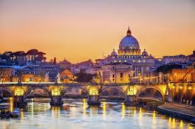
Rome. It is a wonderful city and it has a lot of culture, as monuments, theatres and basilicas.
The activities you've done this week to improve my English have been:
I have been practising my writing doing some essays and I have been listening the radio in English.
A very fun, creative and easy invention is an umbrella that carries a plastic to the ground. This plastic makes that you cannot drop a single drop in your body and you can see the rain through it, while you are walking through the city. In addition, it has a zipper that comes from below to the umbrella. You can open inside the plastic to be able to remove it when you arrive at your house, office or any store.
It could be very useful in countries where it rains a lot, where there are monsoons or just heavy rains. Also, it could be a good invention to protect you from the windier days, since you can arrive in a perfect way to work.
Finally, my techniques of this week about learning English have been:
I have been some chapters of Grey's Anatomy in English and I have listened to the radio in English.
From my point of view, a successful business is a good idea for a project that has developed until it becomes a magnificent business. This successful work has to have a high capital, a special environment of well-known people to sell and to obtain a reputation. Moreover, people who work in this employment should have friendliness, know how to behave and cheerful.
Opinion:
Jayson DeMers, CONTRIBUTOR Here are 3 reasons you won’t ever be successful (and how you can prove me wrong). 1. You Spend Too Much Time on Facebook. 2. You Think You're Working Hard. But You Aren't. 3. You Aren't Efficient.
Choose the best 5 things to take into account for a successful business and justify your answer.
1. Be Fearless. - This point is very important for a successful business since if you are not a brave person, you cannot dare to do nothing. So, people, who plan to have a business, need a huge courage to face this job.
2. Understand Finance. - You cannot reach a relevant position in business if you do not understand finance. This tricky point can build up with the help of several entrepreneurs. Furthermore, finance is the key to be a good businessman or businesswoman and to earn a big sum of money.
3. Acquire Partners. - In order to develop a business, an entrepreneur must have a team of people who know about the theme of a fund. They must have motivation, cheerful and attitude to obtain everything and to better the business.
4. Showing Gratitude. - Education, respect, giving thanks and apologizing are features which any business must have. Entrepreneurs must have these features and not forget who they are. Also, their team must have education and respect while they do their job. It is a fundamental aspect to get a lot of producers.
5. The Importance of Family. - The level of power, which can get a famous entrepreneur, could be an influent to become a selfish person and not think about the family. For that reason, a successful business must not transform your personality and you must always think of your relatives and take care of them.
This week, I have improved my English because I have been reading a book in English called "Sense and Sensibility".
Write a letter to a friend telling him/her, among other things, what you are doing to improve your English when you are not in class. Use phrasal verbs in your letter.
Dear Cloe,
I am studying English everyday to improve it. I love doing exercises in a book, because they are very interesting. Also, you can watch films in English and you can also read some news in the newspapers, in magazines or on Internet. One activity, which you can do, is related to foreign people as an English family. You can practise your English with them twice a week.
I feel proud of me due to the amazing effort that I am doing. I will cheer up when I will obtain my good marks in the English exam. I am sure that you can do the same as me, so you can get better in English and pass your exams.
I'm sorry I have stopped here, I have got to continue with my exercises and I want to watch a film of Harry Potter on Internet in English.
Love,
Inma.
Look for links on the Internet showing how to write correct letters and publish those links in your blog.